Too often we equate a white color palette with something sterile, neutral, and totally dull. An egg shell, a glass of milk, or the overall blasé design of a rental apartment.
It may surprise you that four major paint brands have named white the color of the year for 2016. Trendsetters in interior designer are playing with all-white palettes to create both serenity AND visual interest.
So how do you take a neutral color scheme from “blah” to brilliant?
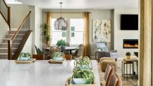
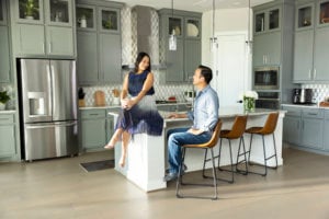
If you think only brightly colored accents can make a statement, think again. Add rugged materials to the mix — wood, tile, and metal — to your overall design scheme. Layer a room in a smorgasbord of neutral colors that equal more than the sum of its parts. The result is a balanced aesthetic that boasts depth and sophistication.
Starting with white and delve deeper into the design plan with layers of neutral colors.
Lita Dirks & Co, the interior design team bringing The NEXTadventure™ Home to life, are playing with this design trend as they finish this showcase single family home designed for the 55 and better demographic. “There are no undertones of yellow or orange,” they tell us. “Today’s white is a whole new ballgame.”
Fabrics in white and metallic hues set the tone for texture and create depth. Bring on the metals, — satin nickel, oil-rubbed, bronze, and brushed gold — and bring on great value to a neutral theme.
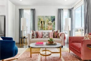
Carefully select your furniture to play off of the theme. Wood details and white fabrics set the tone for integrated design that feels soft, spa-like, and serene.
Wrap it all up with a pop of color in the form of artwork or fabrics to inject the look with energy and personality.
We’re immersed in the latest design trends as part of The NEXTadventure™ Home, a project that showcases the most exciting things in interior design, all inspired by folks 55 and better. Show us how you style your neutrals on Twitter at @taylor_morrison. We’d love to know what you’re up to. Watch the progress of The NEXTadventure™Home using #nextadventurehome.


