Guest Contributor Lee K. Crowder, Design Gallery and Model Home Branding Manager for Taylor Morrison and Darling Homes, shares tips for choosing accent colors
Mother Nature instinctively knows how to paint the world, choosing complementary and contrasting colors that flow seamlessly. As human beings, we’re a bit less sure of ourselves when it comes to choosing colors for our homes, often settling for bland, beige paint colors. With the help of Sherwin-Williams 2020 Colormix® Forecast you can confidently create rooms in your Taylor Morrison home using accent colors that express the right mood and set the perfect tone whether it’s a new townhome in Atlanta or a dream home in Sacramento.
How to Pick a Paint Color
Here are my two tried and true tips for navigating the intimidating wall of paint chips:
- When looking at the paint sample strip pay attention to the very deepest color. It’s a good indication of the base color of the lightest shades on that strip. For example, if you’re looking for a nice neutral taupe and the darkest color on the paint strip is a deep burgundy, that means your taupe will have a hint (or undertone) of burgundy in it. If your paint store only displays individual paint chips, ask to see where the color fits into the paint deck.
- Once you’ve decided on a couple of choices, take them home, ideally with a small paint sample, or with a paper swatch. Don’t buy paint until you’ve seen how the colors react with the artificial and natural light in your home. See how sunlight, shadows and shifting light patterns affect the way the color appears.
- Okay, I lied. I have three tips. Once you’ve done the first two, don’t second guess yourself. Don’t ask everybody on the block and your Aunt Minnie what they think. They don’t have to live with it. You do. Go with your gut!
What’s the Function of Accent Colors?
Everyone knows painting is an easy way to update a room. It’s a quick, relatively inexpensive way to change the whole nature of a space. In fact, paint is our most versatile, effective decorating material. Believe it or not, you can achieve much the same impact with accent colors.
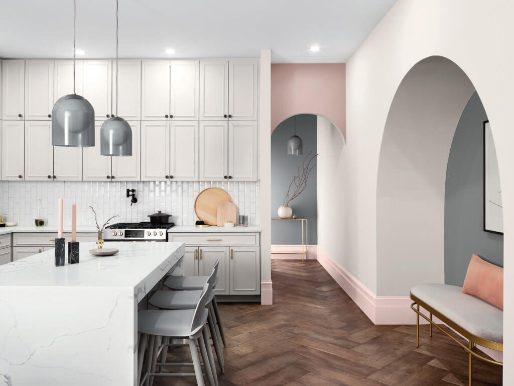
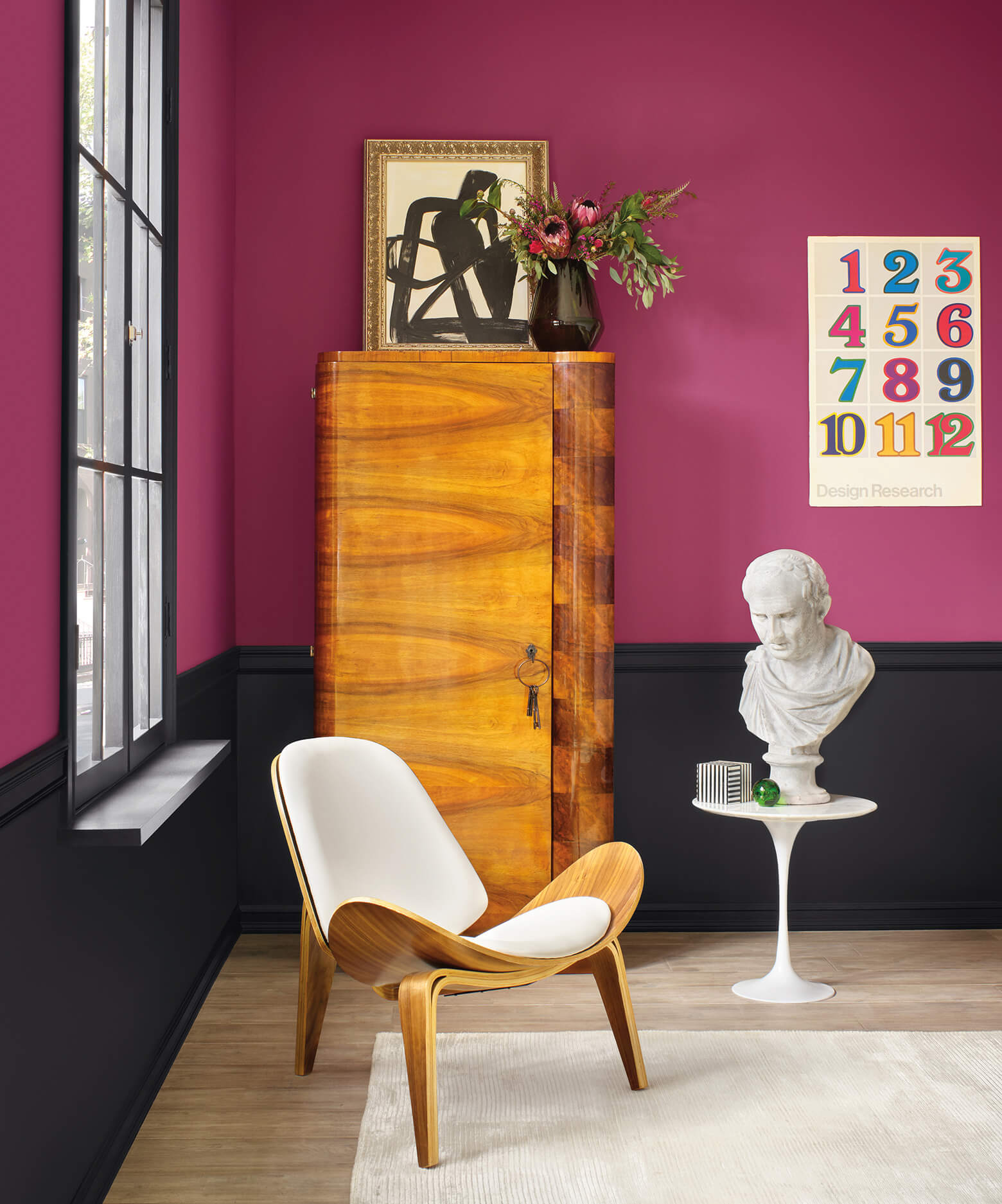
In the Downton Abby days, accent colors were used to identify spaces for social and public occasions, spaces that were for the staff and areas reserved just for the family. Today, we use accent paint to add character to a home or to solve a design dilemma based on two basic rules of color theory:
- Warm colors tend to pull the eye toward a wall, ultimately making a space feel smaller
- Cool colors tend to pull the eye away from the wall, making the space feel larger
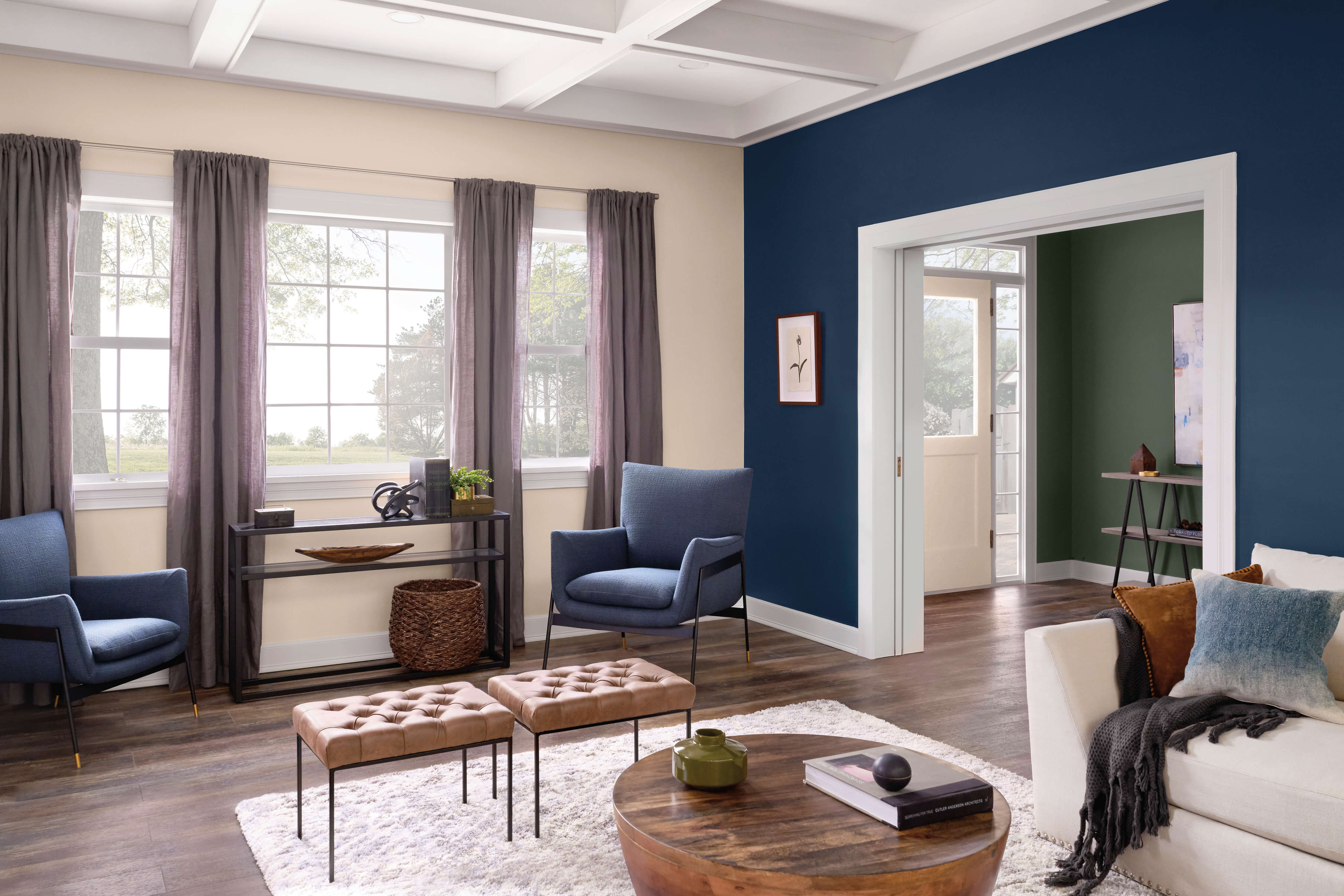
So if you have a large space you’d like to feel cozier, a rich, warm tone works. Want to make a small space feel more spacious? Go with a cooler color.
While you’re at it, inventory the space you want to accent and take into account the furniture, building material, built-ins, fabrics and artwork.
But, at the end of the day, if you’ve found a color you love, go for it!
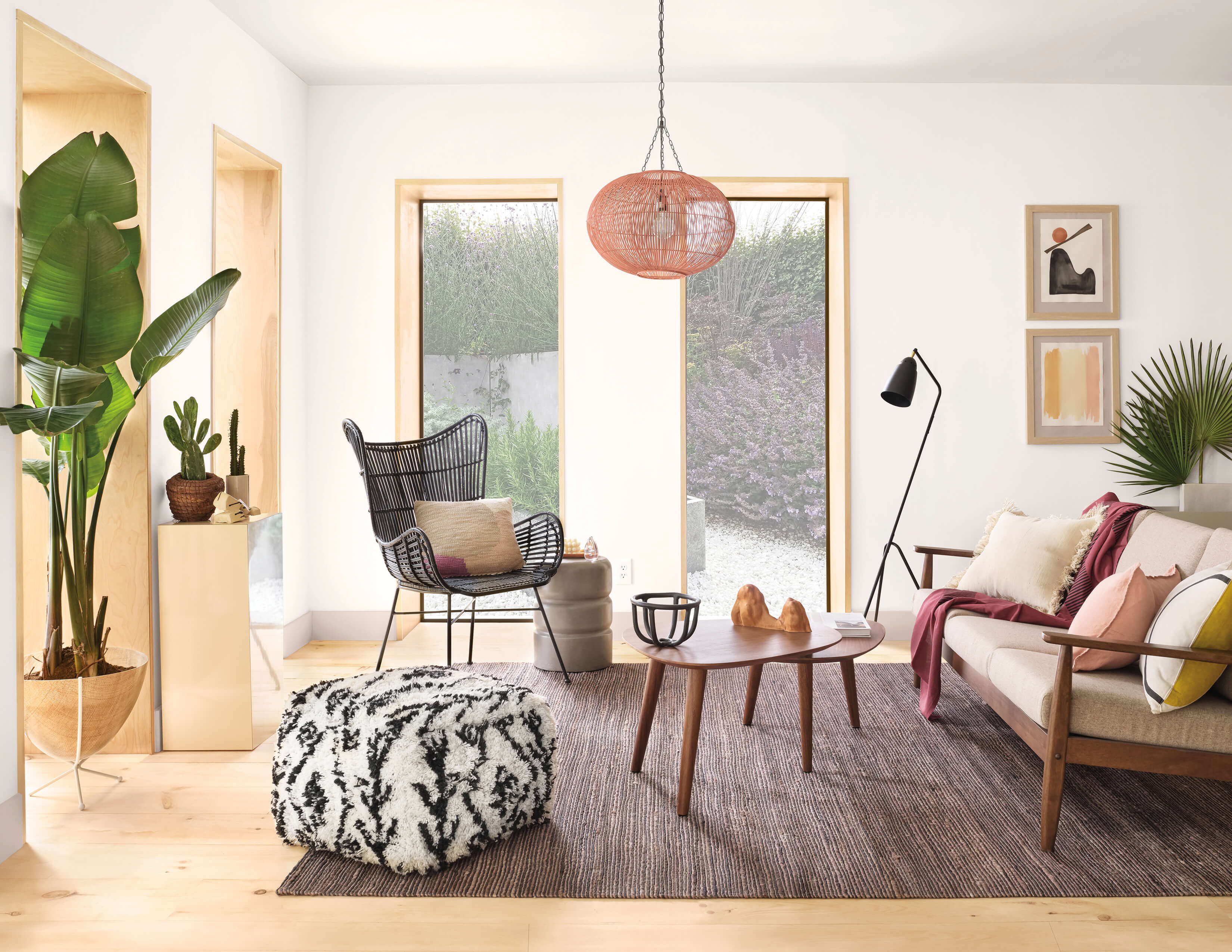
How to Make Spaces Look Brighter or Larger
A dark contrast between walls and ceiling can make a space feel smaller. Less contrast will have the opposite effect. If you really want to brighten a room paint the ceiling white and it will appear higher and brighter than it actually is. Another way to improve overall home brightness is to take the yellow/beige shade out of your trim and interior doors. Use a bright white instead to brighten the entire home and make it feel fresh, new and now.
Set the Mood with Color
Here’s a quick primer about setting a mood with color:
- Blue is the most soothing, calming color family. It works well in a space with morning and evening light.
- Green can reduce anxiety and give a fresh, restorative feel to a space.
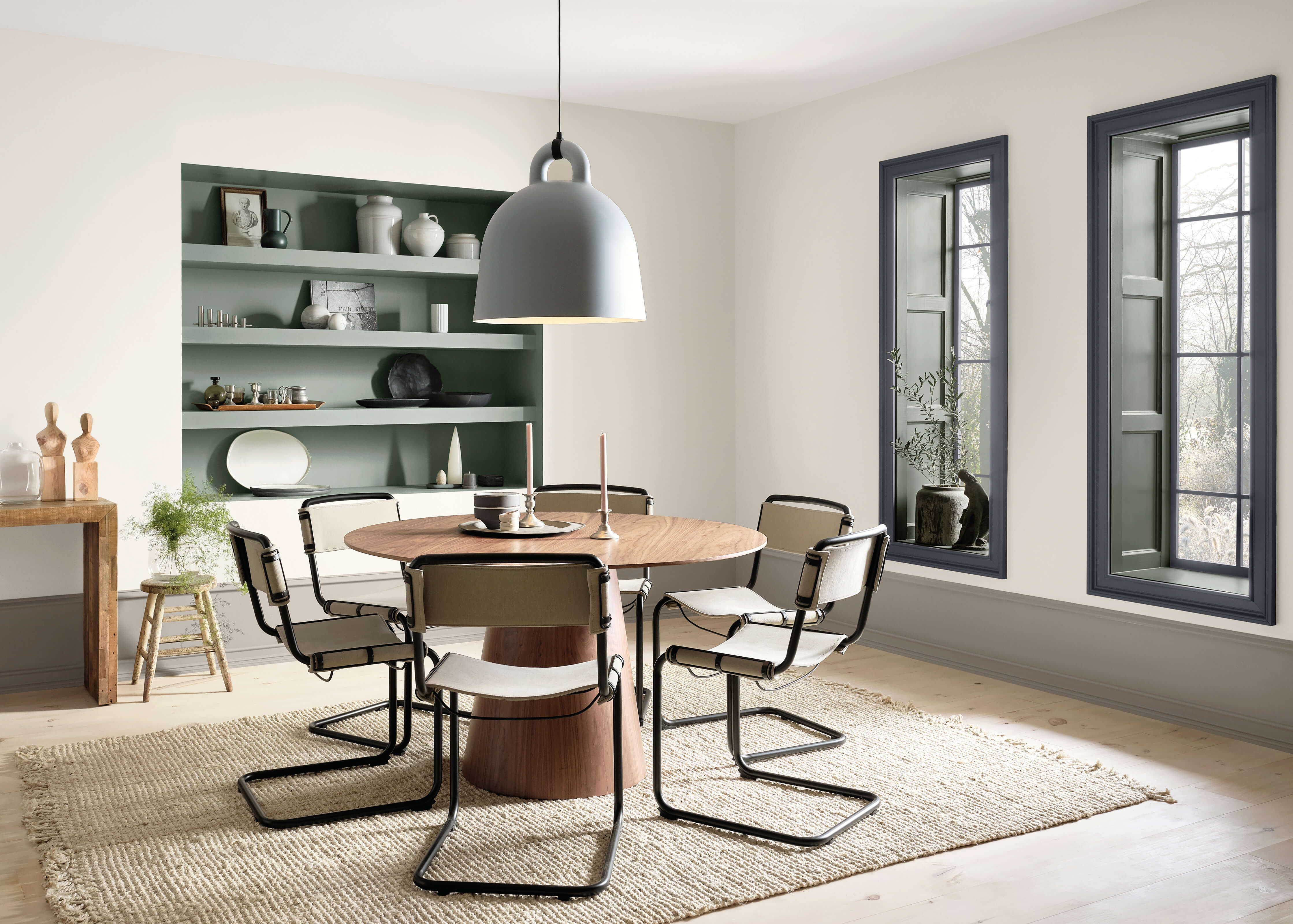
- Brown spans the design spectrum from contemporary to rustic, but ultimately gives a sense of coziness and comfort to any space.
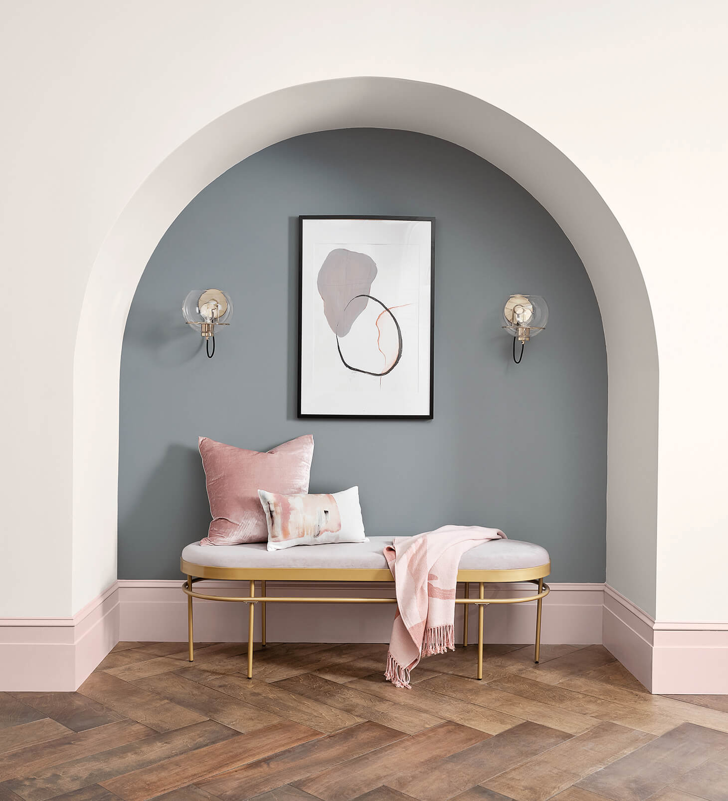
- Grays range from warm to cool and can feel both rich and comfortable. It’s a neutral that works with other colors just like a white base coat.
- Purples add a touch of luxury and spark creativity.
- Red breathes life into the most boring rooms, so it’s best used for social spaces instead of those used for relaxing.
- Pink is having its moment right now and can add a thoughtful character when used in large spaces. It’s also said that the longer you’re exposed to it, the calmer you’ll be.
- Orange is exciting, adding an enthusiastic mood to any space. Orange is also thought to whet the appetite, so keep that in mind.
How Many Accent Colors Should You Use?
If you want to make an overall impact, limit your paint use in a space to a base color and one accent color. In terms of trends, single accent walls are on their way out, while painting a whole room one color is becoming more popular.
I don’t believe that all the colors in a home have to be a picked from cohesive color palette, either. Your social and connecting areas should jive, but it’s okay to use a totally different palette in a closed off space like a bedroom or bath.
When is it Time to Change Your Paint Colors?
Generally, give your base home and trim colors a fresh new look every five to seven years. Spaces you use more often may need a facelift more often. A kitchen, for instance, gets lots of daily wear and tear. Instead of constantly touching up scrapes and scratches, it might be easier just to repaint the entire kitchen.
Inspirational Color Ideas
Okay, that covers the nuts and bolts. Time to have some fun. I really love the Sherwin-Williams® Colormix® 2020 Forecast and I bet you will too. Each of the five palettes tells a different story with a combination of paint colors: Mantra, Alive, Haven, Play and Heart. Every story had a color I was drawn to, so here are my favorites and how I would use them at my house.
- Sherwin-Williams Naval SW 6244. I’ve been waiting to paint my master bedroom a deep rich blue and this will be a perfect fit!
- Painting all my interior doors a dark color has been on my project to-do list for some time. Perle Noir SW 9154 is now the front runner.
- Also on the procrastinated projects list is our upstairs guest bath. It isn’t used on a daily basis so I think a trendy color like Coral Clay SW 9005 will update it and still go with the countertops.
- Will Aquarium SW 6767 make me want to do my laundry? It will definitely make me happier to be in the utility room.
- We painted all of our trim and exterior siding Software SW 7074. It’s a grey contrast gray that suits our lot, which has lots of trees and shade.
I naturally gravitate toward colors with deeper pigments. Take a look at Sherwin-Williams Colormix® 2020 Forecast to see what colors you’re drawn to![1] And if you’ve just purchase a new Taylor Morrison home, be sure to take your choices with you when you visit the Design Studio to add your signature touch to your new home.
Additional Helpful Information
- How To Decorate Your New House Like A Pro
- Details Matter: How to Bring Light to Every Room in Your Home[ET1]
[1] The colors specified here are from the Sherwin-William Colormix® Forecast 2020 at https://www.swcolorforecast.com